Man and Machine
Auditing and Re-Designing Consumer Facing Websites.
Project Duration - 2 Weeks
Project Team - Shane Scally, Morgan Smyth, James Kehoe
Read Time- 5 Mins
Project Tasks
• Choose a poorly designed website
• Asses website using Nielsens 10 Heuristic Principles
• Conduct User Testing on current website
• Create and test Low-Fi Paper Prototypes
• User test Mid-Fi prototype mock-up
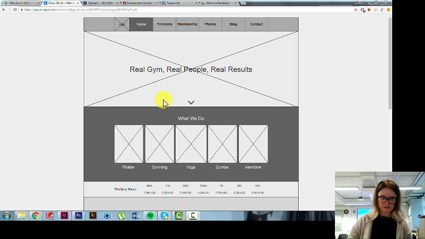
The site we chose for a redesign was the Phibsboro Gym website which we felt had a lot of usability issues that we could address.
To complete the evaluation we used Nielsens 10 Heuristics principles and tried to pinpoint the main usability issues and labeled them as a minor, major or critical usability issue. This would give us a clear indication of what we needed to change to improve the sites usability.
The next step for our website evaluation was to conduct some user testing on the existing website and to create user journeys to see exactly how a user would expect to navigate through the website. Using a screen and face recorder we set two tasks for our users and asked them to complete the tasks.
• Choose a poorly designed website
• Asses website using Nielsens 10 Heuristic Principles
• Conduct User Testing on current website
• Create and test Low-Fi Paper Prototypes
• User test Mid-Fi prototype mock-up
The site we chose for a redesign was the Phibsboro Gym website which we felt had a lot of usability issues that we could address.
To complete the evaluation we used Nielsens 10 Heuristics principles and tried to pinpoint the main usability issues and labeled them as a minor, major or critical usability issue. This would give us a clear indication of what we needed to change to improve the sites usability.
The next step for our website evaluation was to conduct some user testing on the existing website and to create user journeys to see exactly how a user would expect to navigate through the website. Using a screen and face recorder we set two tasks for our users and asked them to complete the tasks.
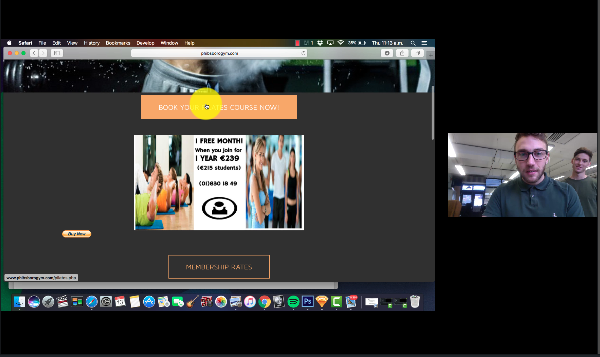
After our existing site evaluation we began the process of redesigning the website. This process started with low fidelity sketched wireframes, moving on to a higher fidelity version with paper prototyping and testing and finishing with a mid-fi website redesign using moqups.
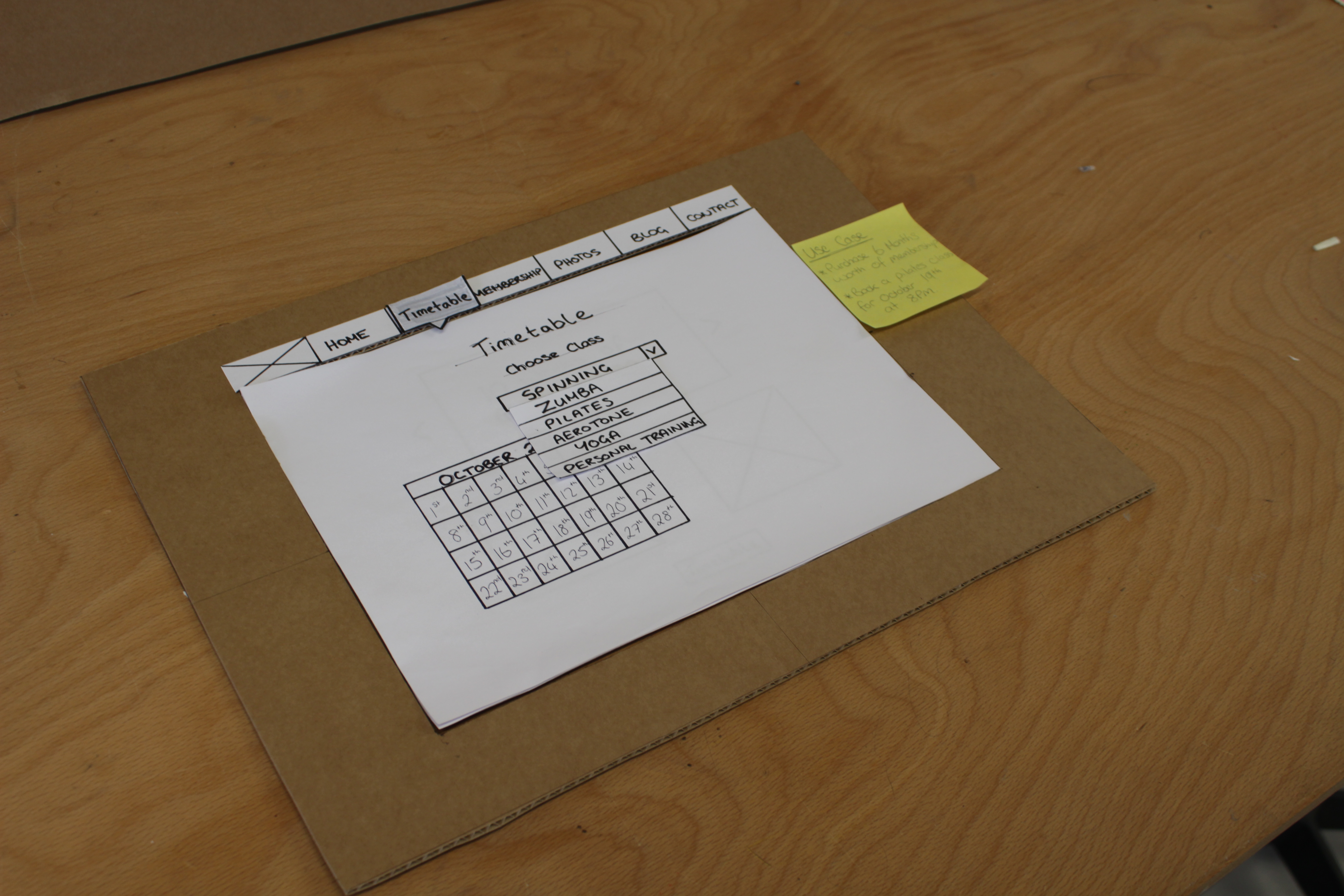
Paper prototyping and user testing with these prototypes was the next step in order to see exactly how a user would navigate through my new redesign and to try and pick out any points that they were having difficulty or struggling with. After some small iterations after testing with users I could move on to my higher fidelity mock ups of the new website.
Paper prototyping and user testing with these prototypes was the next step in order to see exactly how a user would navigate through my new redesign and to try and pick out any points that they were having difficulty or struggling with. After some small iterations after testing with users I could move on to my higher fidelity mock ups of the new website.
The mid-fidelity wireframes for the website were made using Moqups and these were used to get a general feel for how the website will work. By adding in hotspots on the pages the users were able to navigate their way around the mid-fi prototype like a regular webpage and provide feedback on what they thought was good and bad in the website redesign.