Car insurance renewals flow
Restructuring the summary page to increase conversion
Read time: 5 mins
Read time: 5 mins
Roles and responsibilities
Senior UX Designer (me) - Concept ideation, advanced prototyping, stakeholder management, support creating KPI's
Senior Optimisation manager - Advanced interaction tracking, conducting A/B test
Senior Product manager - Analytics support, legal and compliance support
Background
The car insurance renewal feature is one of the biggest drivers of returning business in Compare the Market and is responsible for a large share of our revenue each year. Renewals are split into two categories, standard renewals quotes and Autochecks (over 1 million users are signed up to car insurance Autochecks). For each of these categories, Compare the Market takes a quote that a user has done the year previous and then updates some of the answers to reflect what they will be one year on. Examples of what we update are:
When a user has signed up for an Autocheck, we take this information and then run a quote for them and contact them with information about the cheapest available prices based on this quote. If a user has not signed up to Autocheck, they receive a renewal quote in their account. A renewal quote is the exact same as an Autocheck in that we update some of their key details but we do not go and get prices for that quote and do not send out the relevant comms.
When a user interacts with an Autocheck or renewal quote from their account or an email, they must first view a summary of some of their key details to ensure that the quote they are getting is relevant to their circumstances. After they have reviewed this quote, they can continue through and see the car insurance prices and then click through to a specific provider to purchase the product.
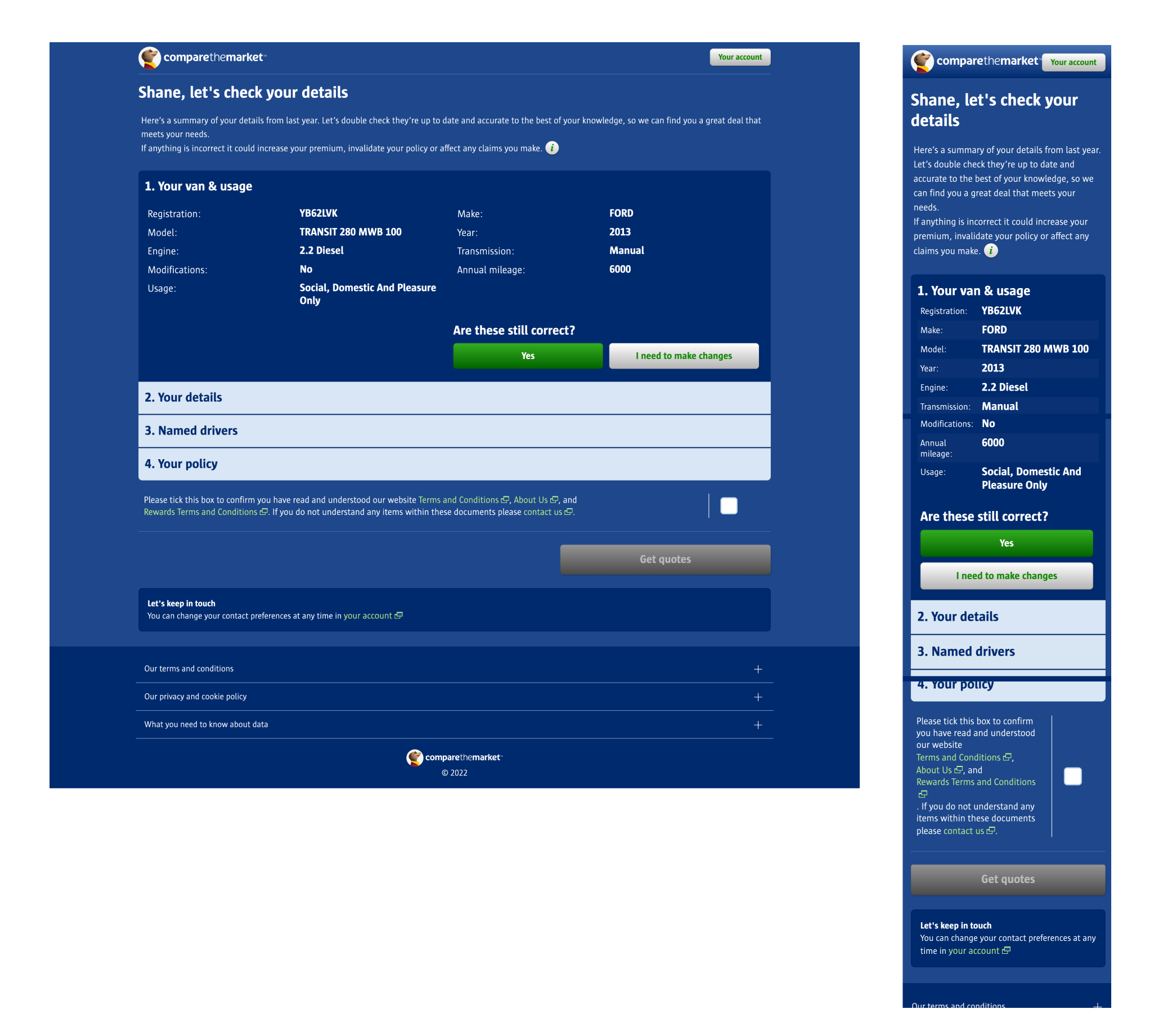
On the page where they have to review their details, the user is presented with a short paragraph of personalised information about their renewal, and then must click through 4 collapsed accordion sections, and must confirm after each one that their details are correct before accepting the T’s&C’s and continuing to their results.
Page header
The first area of the page I wanted to look at was the top section. This was going to be the first thing that a user would read when they landed on the page so I wanted to make sure the copy was informative and consistent with the rest of the experience.
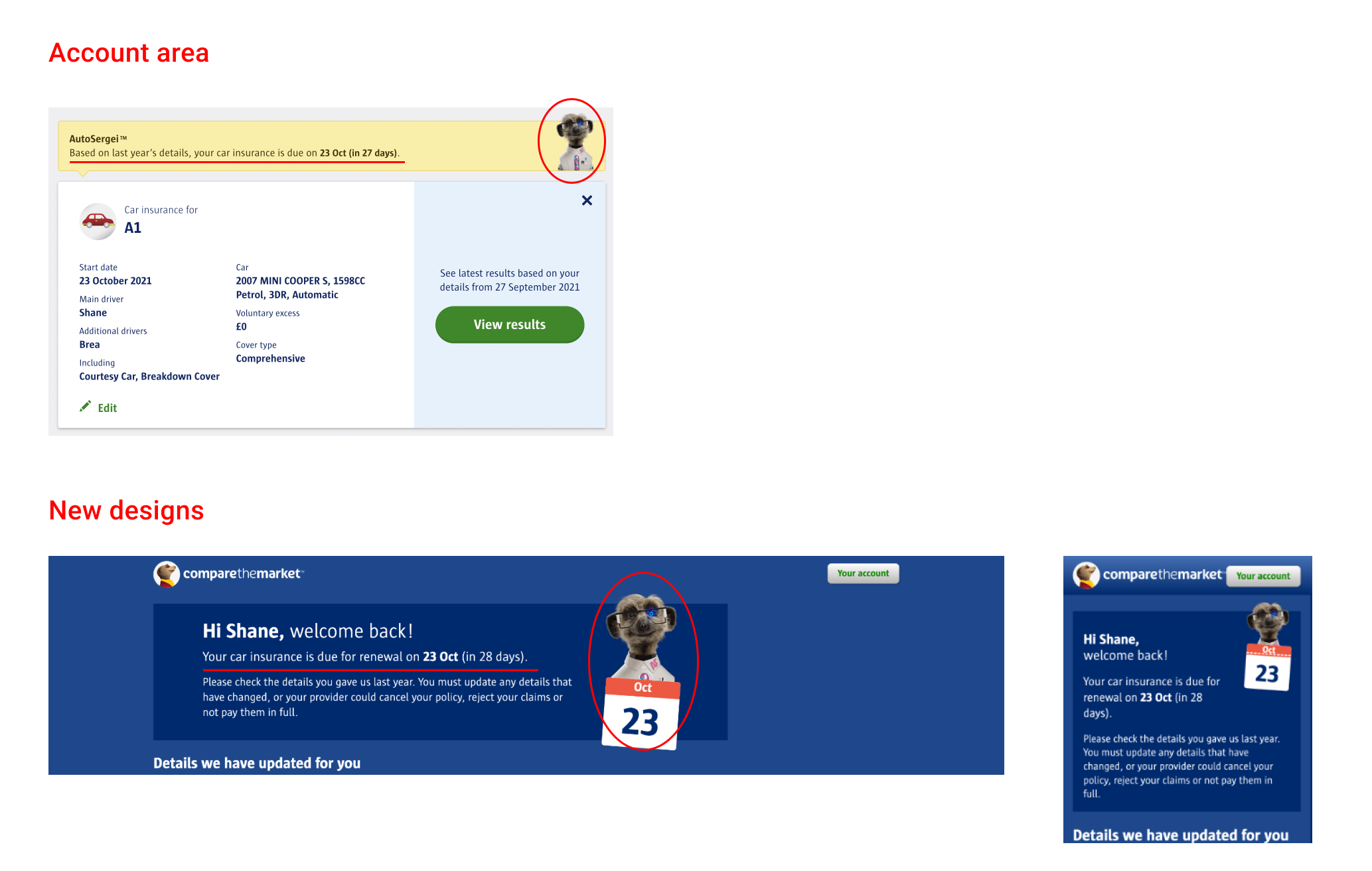
When a user comes to this summary page, they will always click through from a quote card in their account section, to make the experience as consistent as possible I wanted to carry through some of the wording and imagery used. The inclusion of the start date of their new policy and the imagery of Sergei holding a calendar with the relevant date would hopefully inspire confidence that they were still on the right track to renewing their insurance.
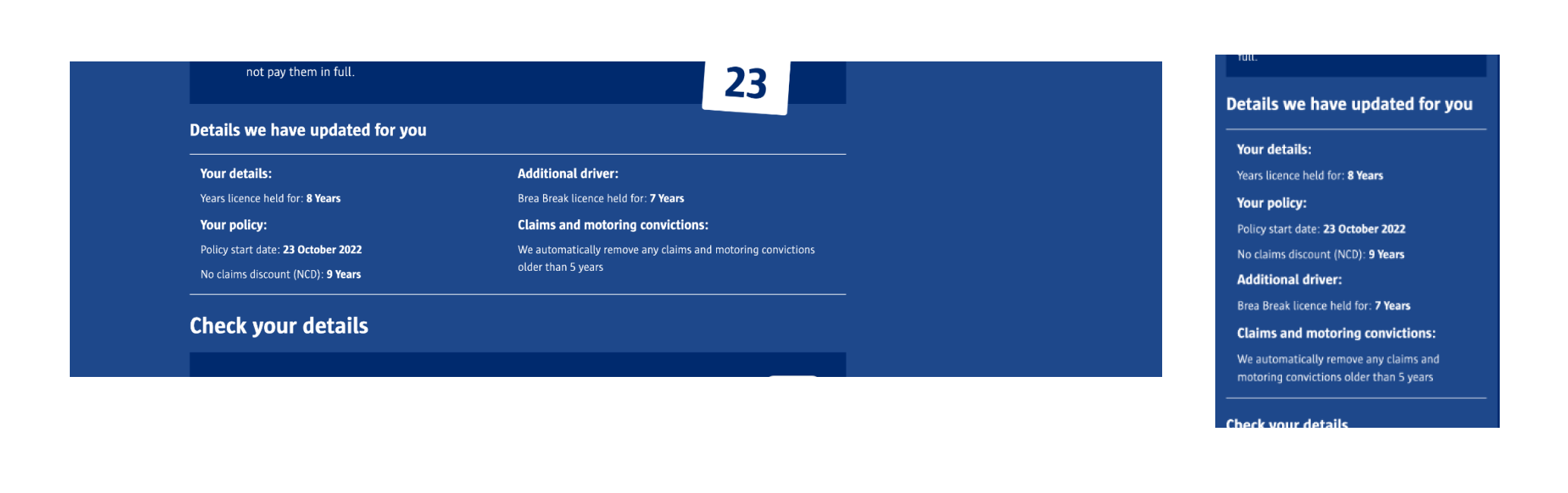
'Details we have updated for you'
From some of the qualitative research that was carried out on the renewals experience, participants stated that being informed and confident about the details that have been incremented from the year before were the most important aspect when reviewing this page. To try and make these details as prominent as possible, we added a new section at the top of the page with “Details we have updated for you”.
This section clearly calls out the information that has been updated for a user and was introduced to alleviate any concerns about the updated information and lessen the need for them to seek out all of the specific pieces of information in the table below.
Content structure
Another learning from some of the qual research was around how users were often confused about having to click through each section and not being able to interact with the disabled “Get quotes” CTA at the bottom of the page.
To restructure this page, the first step was to take all of the quote information out of the collapsable sections and lay it out in a more linear format down the page that a user can easily scan.
Removing the collapsable sections was hypothesised to have the larger impact on mobile users. In the current designs when a user clicked on “Yes” to a specific section and another opened, the page wouldn’t anchor them to the next section and instead often what they saw was another block of information with no context. By removing the sections and laying out all the content vertically down the page, users are easily able to scroll down, scan over the quote information and then arrive at the T’s&C’s and “Get quotes” CTA at the bottom of the screen.
On desktop it was hypothesised that the biggest benefit of this new layout was around how the content was structured. On the existing summary page the answers for each section were spread across two irregular columns which made the content hard to scan and check over. By moving to having the questions and answers stacked vertically in a more conventional ‘F pattern’, we wanted to make it as easy as possible for a user to scan the information and proceed to their results.
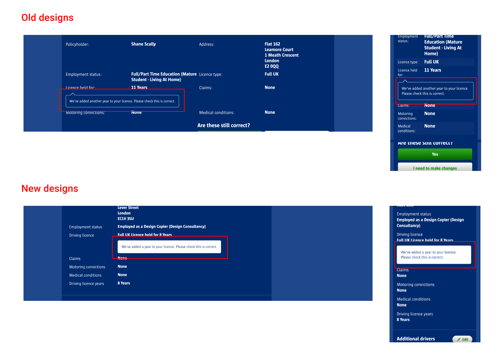
Highlighted content boxes
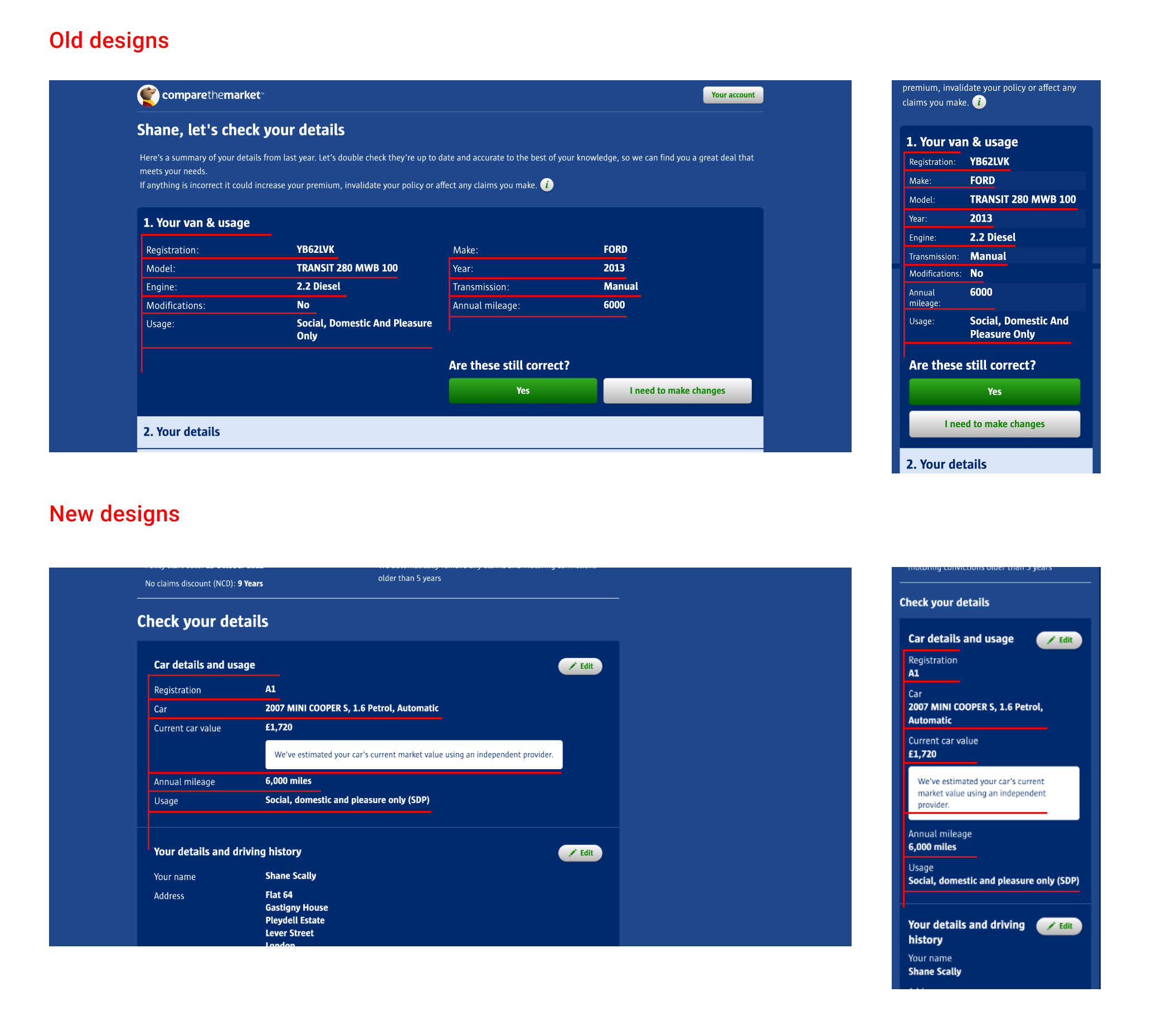
The last change to the page was looking at increasing the prominence of the message that we have updated some information for you based on last years quote. On the old designs this message seemed to fade into the background of the page due to the outlined content box and small text. To increase the prominence of the message I added a solid white background to the content box that would provide suitable contrast with the page background and set the text as the same colour as the page.
Increasing the prominence of these messages would make it easier for users to seek out the pieces of information on the page that were updated automatically based on last years quote and change them if necessary.
Business impact
After the new designs were signed off by our commercial and compliance teams, they were launched on the website as an A/B test which ran over the course of 3 days, starting going live to 1% of customers and eventually ramping up to 100% of Autocheck/renewal customers.
After the test reached significance, we observed a 5% increase in Summary Page to Provider Click Through for the variant which was estimated by the commercial finance team to be worth £3.7m in revenue p/a.
After its conclusion the winning variant was hardcoded and launched to all Autocheck and renewals customers on the website.