Designing accessible car insurance forms
Industry
Insurance Fintech
The team
Senior Product Designer (me), Product Designer, UX Researcher and Senior Product Manager
My role
I led design across the discovery, ideation, user testing and delivery:
- Deep dived into existing form completion data
- Researched best practice accessibility guidelines
- Created and tested interactive prototypes with Figma and Axure
- Synthesised research learnings and iterated on existing designs
- Created pixel perfect designs for delivery
User Impact
- Increased user confidence - Car insurance forms were designed to be truly mobile first, giving users confidence that they have given the correct information for an insurance quote.
- Focus on accessibility - Partnering with the RNIB (Royal National Institute for the Blind) meant that we were able to deliver a best in class accessible form solution for all of our user types.
- Reduced time to complete form - Our solution reduced on average the time for a user to accurately complete the car insurance form.
Business Impact
- WCAG 2.1 AA - Insurance companies are regulated by the FCA in the UK, which means by law they need to meet AA accessibility standards, our solution set Compare the Market up to be accessible across all of their insurance form flows.
- Long lasting partnerships - This was the first project where Compare the Market engaged the RNIB, and since then they have been a close partner to design at CtM.
- Rolled out on the largest product - This solution has been adopted by the largest product, car insurance, which sees over 1 million users each month.
The Challenge
Insurance forms are long, at it’s worst, to get a home insurance quote you need to fill out over 66+ questions. Analytics showed users were dropping off mid-way, frustrated by complexity, time, and accessibility barriers.
We needed to answer:
- How does form structure impact time to complete, perceived time, and ease of use?
- How can we design a structure that works for both high-engagement users and vulnerable groups (physically impaired, autistic and dyslexic)?
- How confident are users about the information they have just entered?
Research & Discovery
Secondary Research and Internal Data
As a starting point for this project we first looked to the significant body of research the GDS (Government design system) have carried out on question sets and online forms. The research carried out by GDS recommends that you should always start designing a question set using a “One thing per page” format. While only having one question on each page may seem time consuming, starting with one thing on a page helps people to:
- Understand what you’re asking them to do
- Focus on the specific question and its answer
- Find their way through an unfamiliar process
- Use the service on a mobile device
- Recover easily from form errors
From past tests, this format gave us a 5.5% completion uplift on short 10-question forms. The question was: would it scale to 66 questions?
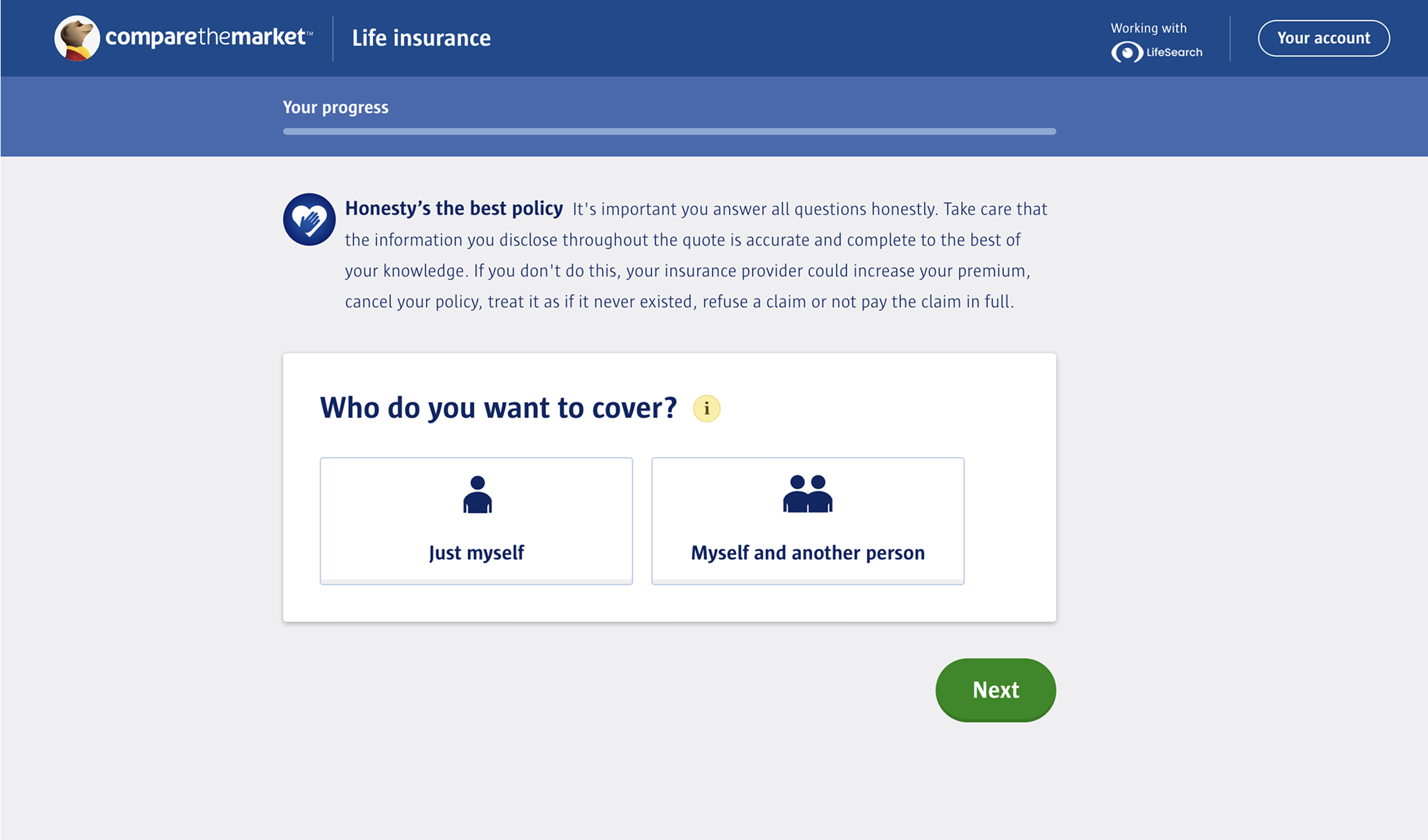
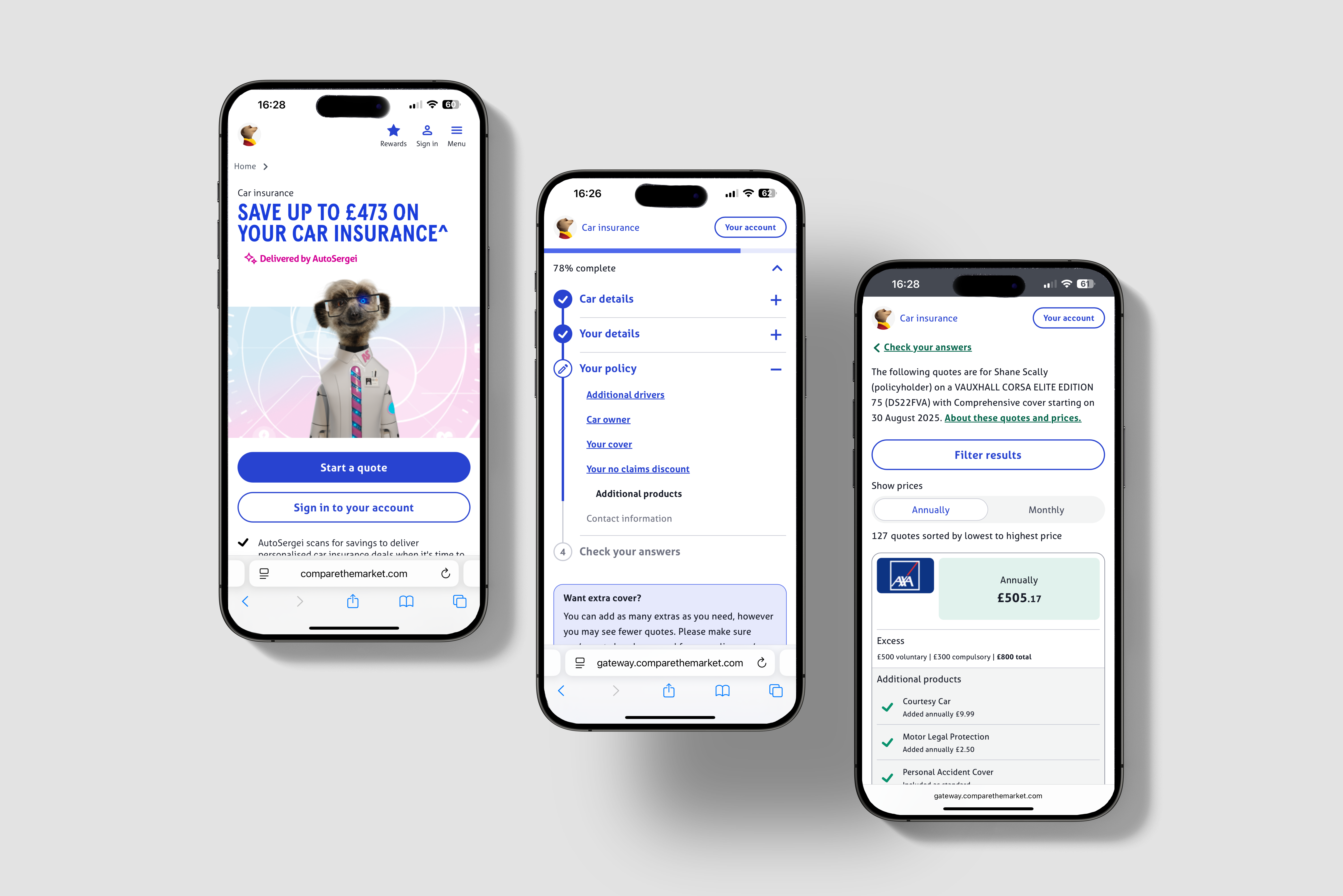
Life Insurance Product with OTPP Structure
Round 1: Usability Testing
For our first round of testing, we wanted to test three different page structures with the longest question set. The three formats we tested were:
- 4 Sections - grouped questions across 4 pages
- One question per page - 66 single-question pages
- Progressive reveal - one long page, sections unlocked step by step
Our hypothesis before testing was that one question per page would be perceived as the least favourable, with progressive reveal and the 4 sections prototypes being more favourable due to the length of the question set.
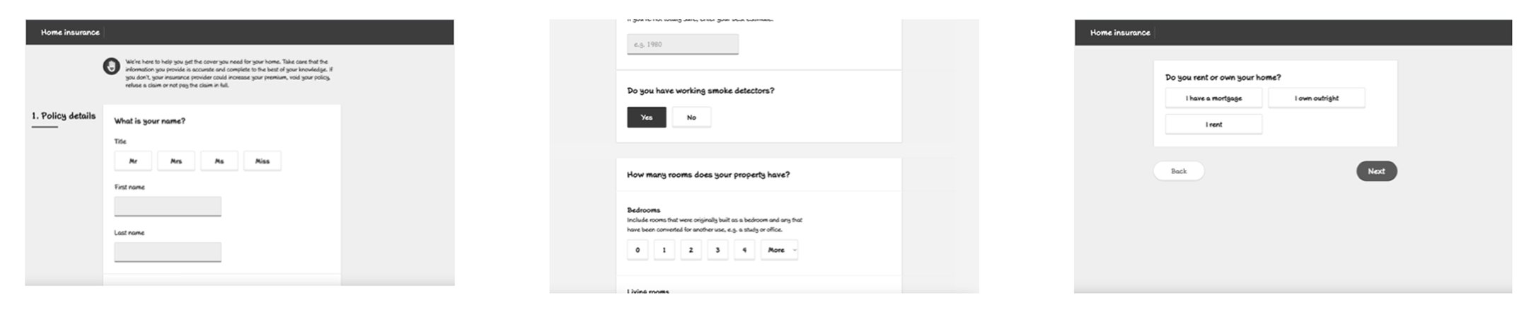
Three Early Low-Fi Axure Prototypes
Test structure - 20 one and a half-hour sessions over 5 days, with a 50:50 split between mobile and desktop.
Participants - The participants were a mix of high and low engagement users, some of which had been diagnosed with autism, dyslexia and anxiety.
Test format - The participants were shown two of the three prototypes in alternating orders.After users had navigated through two prototypes they were asked a series of questions about the forms they went through. The answers to these questions were used to deduce wether a user had a low, mid or strong preference towards any of the three prototypes.
Round 1: Results
One question per page surprised us: most preferred it, citing better accuracy and focus. Preferred by 8/13 users who saw it. The majority having a strong preference (5) and lesser having mid (1) and low (2) preference.
4 Sections was acceptable but often felt overwhelming. 6/11 users who saw it had a preference for this prototype. These preferences were mostly low (4) with mid (1) and strong (1) preferences less common.
Progressive reveal was least favoured; users didn’t like the hidden sections. Preferred by 4/12 users who saw it, all of which had a mid preference for it.
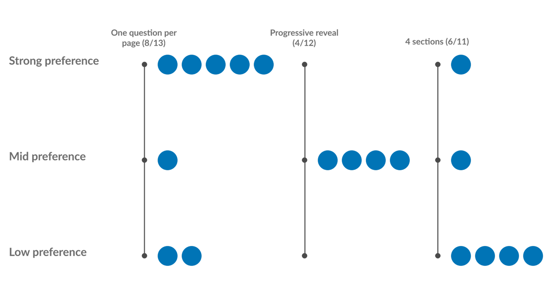
Preference Ratings for Three Prototypes
Round 2: Quantitative Validation
After the first round of qual testing, we ran a larger quant study with ~150 users (50:50 mobile/desktop) for each prototype. This study was more focused on time taken and perceived time taken. Secondary questions around ease of use and understanding of questions were also asked.
Round 2: Results
Time to complete: One-per-page was longest (~450s); 4 Sections and Progressive Reveal faster (~350s).
Perceived time taken: After the task the users were asked to rank on a scale of 1-7 if they strongly disagree (1) or strongly agree (7) with the statement “The time taken to complete the form was acceptable”. We saw very little in the differences between the three prototypes.
Confidence: On mobile, one-per-page scored best for user confidence in accuracy.
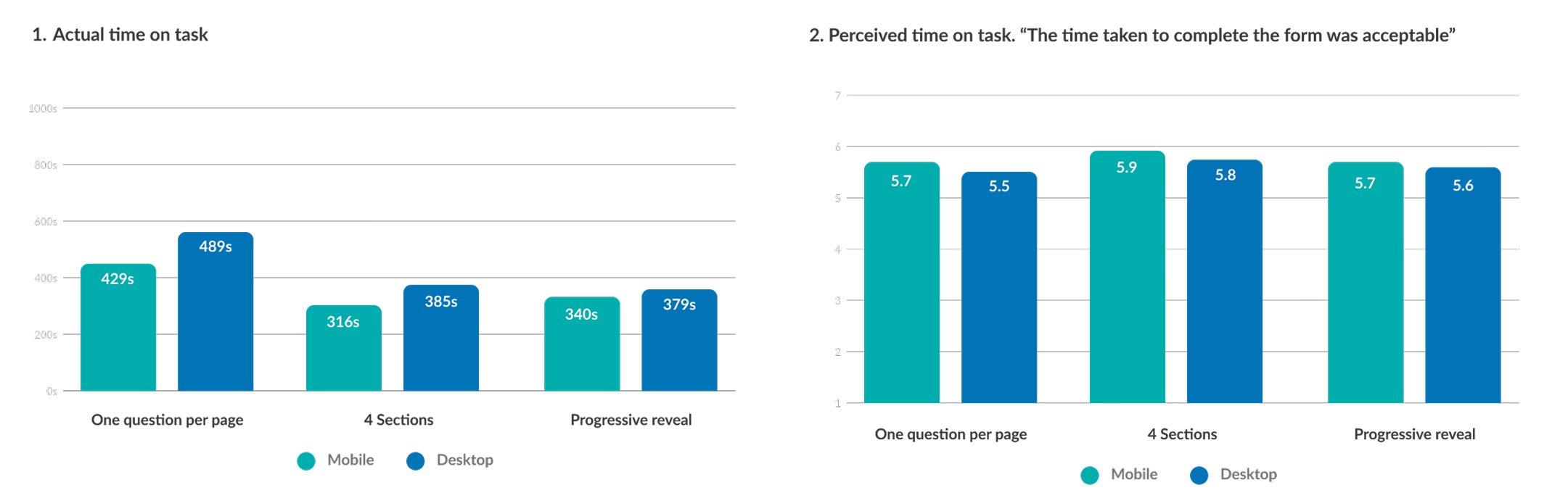
Actual Time on Task vs Perceived Time on Task
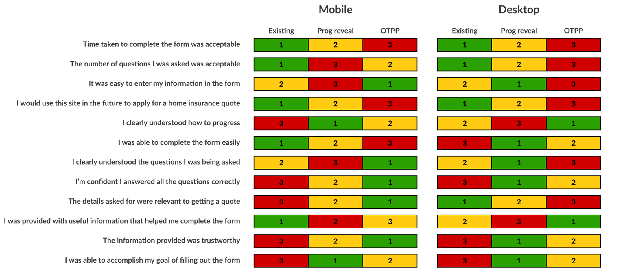
Ranking Table Based on Users Feedback to Questions
Design Iteration
“Some Questions per Page” (SQPP)
To balance accuracy with efficiency, I worked to design a hybrid format which balanced keeping the same focus as seen with One question per page, with the speed of the 4 sections format. For this iteration we had:
- 1–4 questions per page , based on cognitive load
- Complex questions isolated; simple ones grouped
- Grouping was informed by an open card sort with 100 participants
This reduced our prototype from 66 pages → 24 pages.
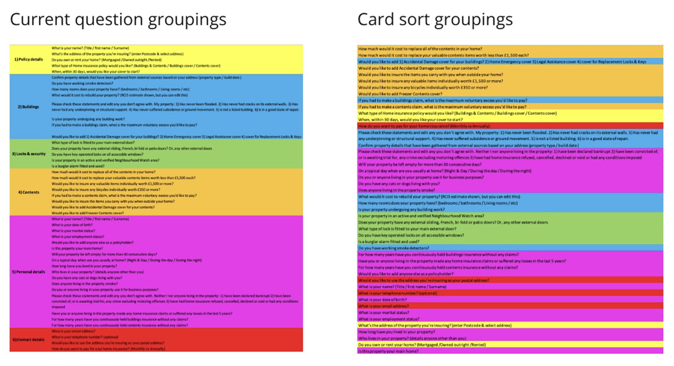
Outcomes of Card Sorting Activity
Round 3: Qualitative Testing SQPP
Test structure - 8 one hour sessions over 5 days, with a 50:50 split between mobile and desktop.
Participants - The participants were a mix of high and low engagement users, some of which had been diagnosed with autism, dyslexia and anxiety.
Test format - All the users were shown the new some questions per page question set and the current live question set as a control. Key metrics we wanted to focus on was the perceived time to complete the form, and their confidence in the information entered.
The prototype for this test was made on Axure and can be seen here - Some Questions Per Page Desktop
Round 3: Results
Of the 8 participants, 4 users said they felt the process was quicker than expected, 3 said it was as expected and one said the process felt longer than expected.
As well as this, nobody commented on the amount of times they had to click to move on to the next page (One question per page had 66 pages and some questions per page was cut down to 24 pages).
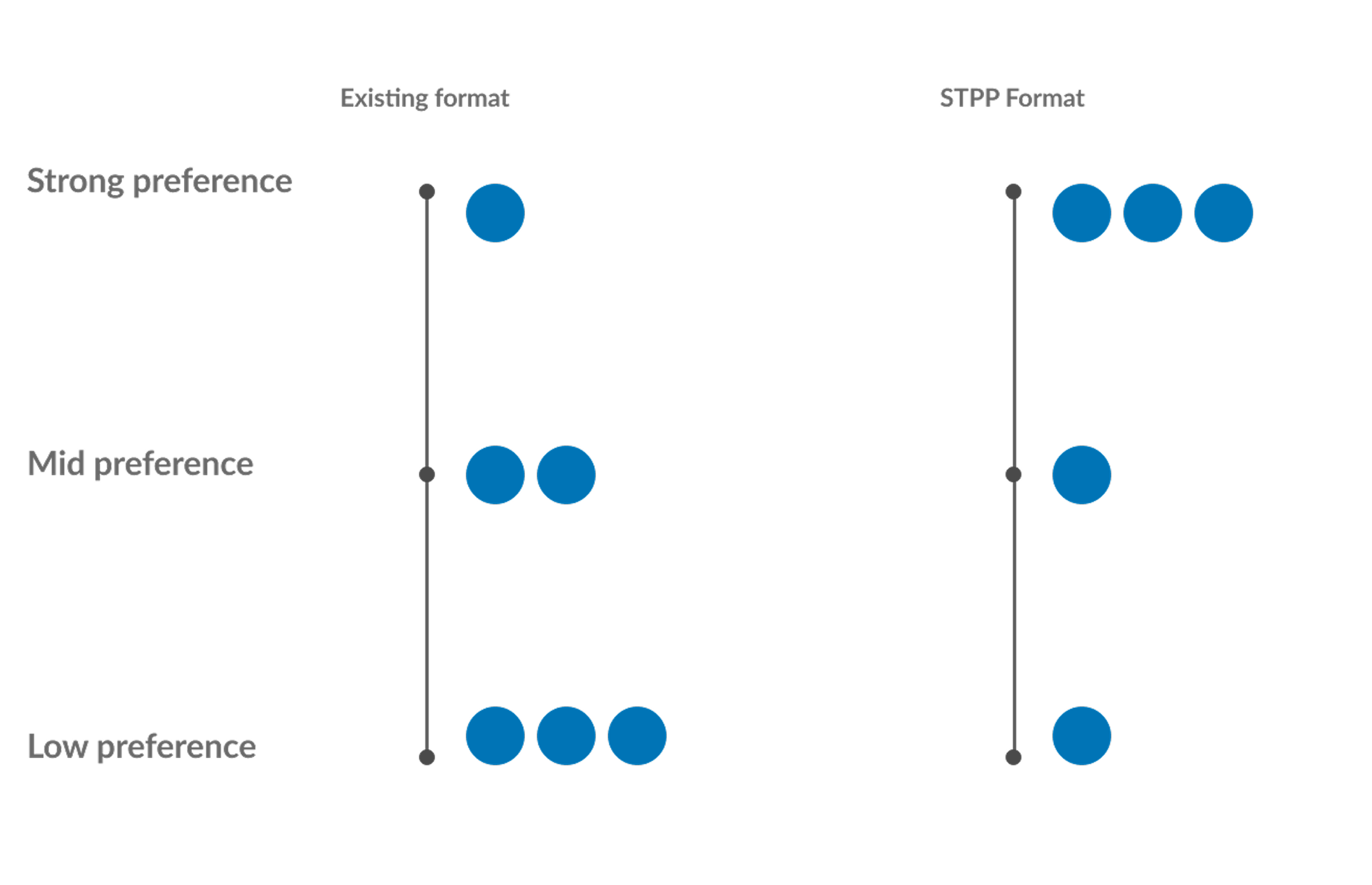
Preference Ratings for SQPP and Control
Round 4: Quantitative Testing SQPP
Again, we then ran a larger quant study with ~160 users (50:50 mobile/desktop) for each prototype. This study was more focused on time taken and perceived time taken. Secondary questions around ease of use and understanding of questions were also asked.
Round 4: Results
- Reduced completion time vs one-per-page (–70s mobile, –40s desktop)
- Higher acceptability ratings (mobile 6/7, desktop 5.9/7)
- Scored highest in winner/loser ranking across ease-of-use and confidence
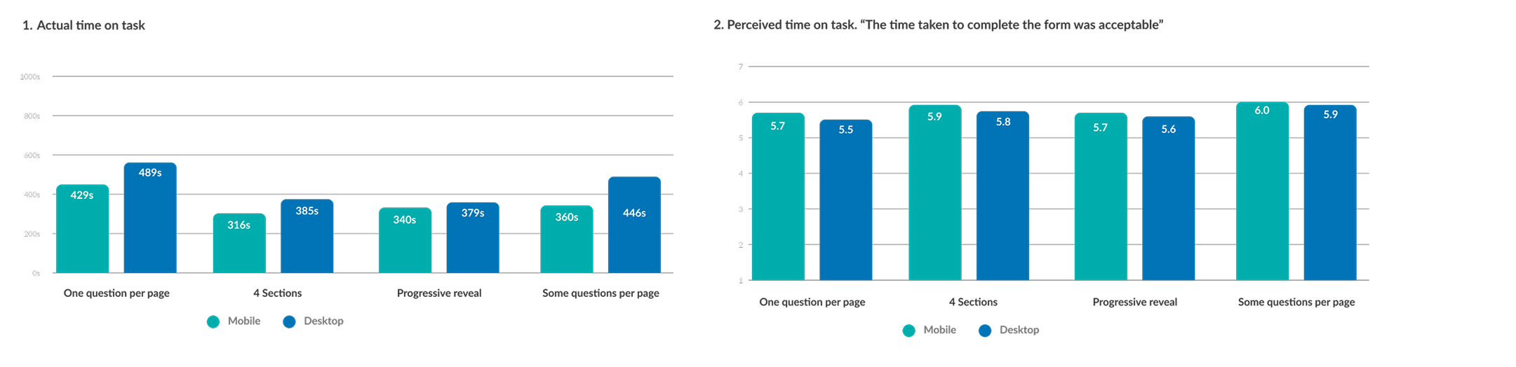
Actual Time on Task vs Perceived Time on Task
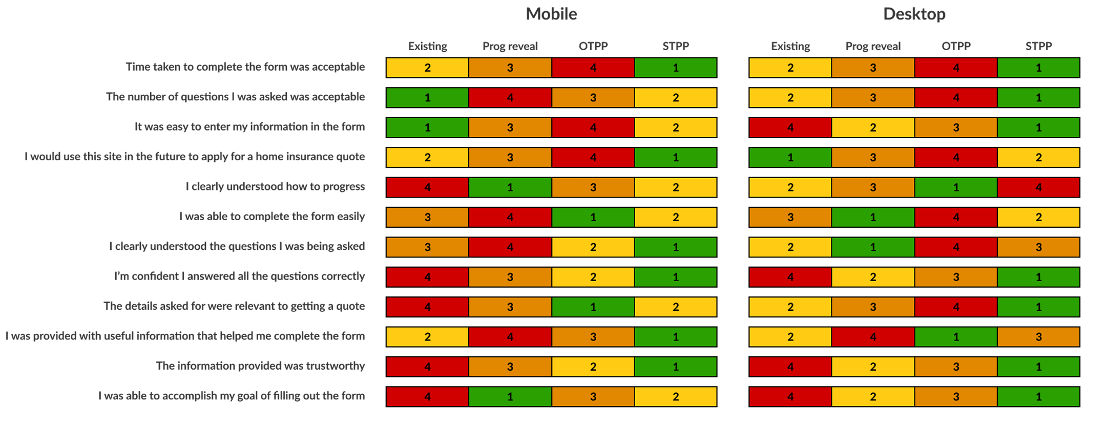
Ranking Table Based on Users Feedback to Questions
Accessibility: RNIB Consultation
Alongside this research, we also held a consultation session with some usability experts from RNIB (Royal National Institute of Blind People) and presented the four different form page structure.
The conclusion after seeing each of the prototypes was that One question per page was the preferred format for assistive technology. This was due to the limitation of errors that may present on a page as well as ease of use in how to fix these errors.
It was however accepted that in situations where one question per page may not be possible. The approach we have taken with some questions per page is the best compromise and still desirable from an accessibility point of view.
Business Impact
This version of the car insurance question set was released after I had left Compare the Market so I don’t have any data on how it has performed regarding completion rates and general NPS scores. This version of the form is still live today on Compare the Markets largest product, so I will assume it has performed well 😀
Aside from conversion metrics, what we have successfully done in this project was to design an accessible form filling experience for all of our customers which will now crucially include our most vulnerable customers. Our new design system meets WCAG level 2.1 AA standard as required by the FCA and our quote journey we feel meets the same standards for usability.
Other projects
Creating a culture of experimentation
How I helped to implement a culture of experimentation in a historically risk adverse B2B payments company.
See more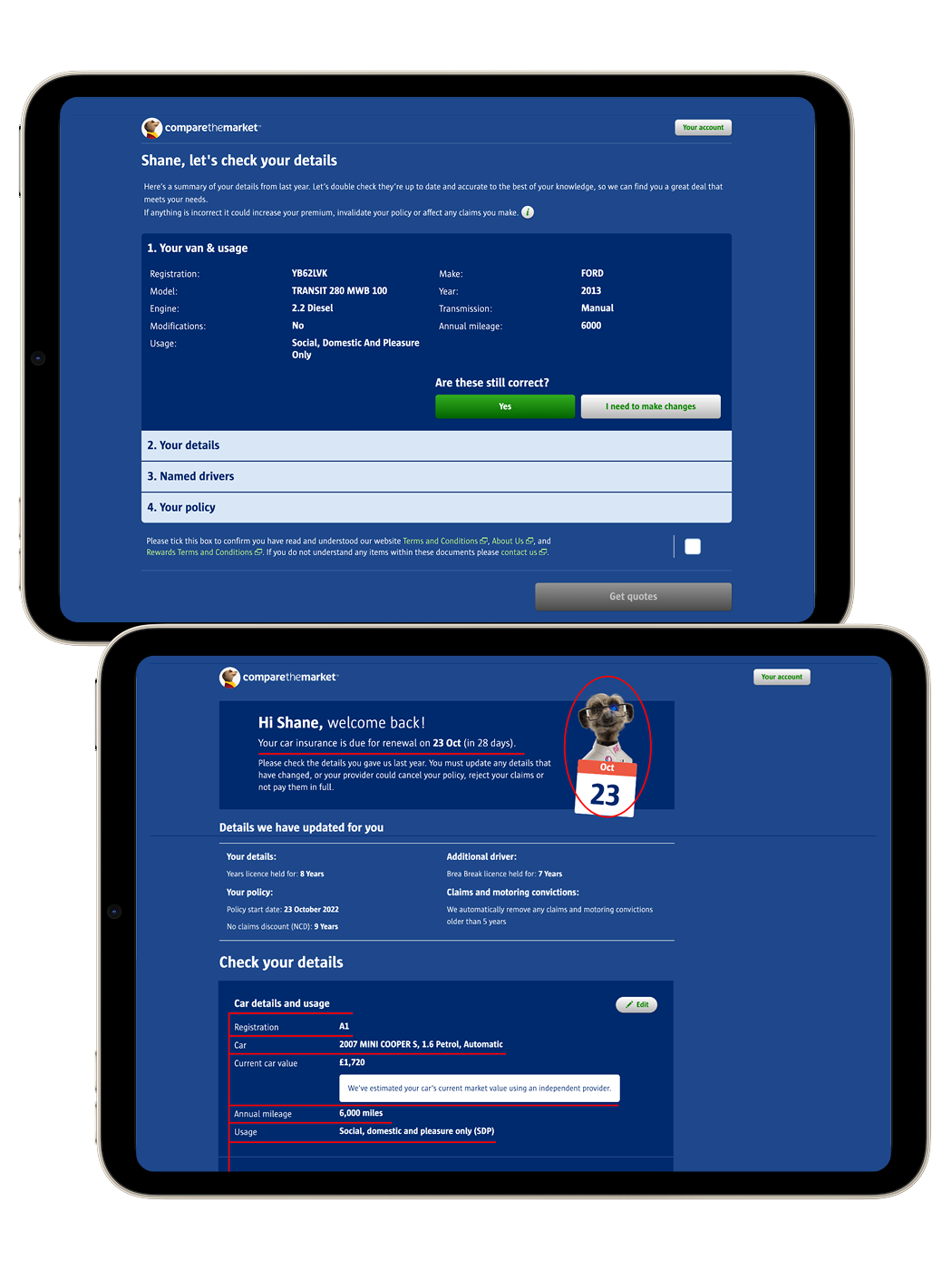
Optimising car insurance renewals
How I restructured information architecture and applyied best-practice UI principles to boost conversion rates for car insurance renewals.
See more